In today’s world of digital abundance your business website needs to work extra hard to gain the confidence of those who visit it.
Unfortunately we live in a world where we judge by appearances, making split second decisions for better or for worse.
That’s why, figuratively speaking, your website needs to dress smartly and make eye contact if it is to stand a chance of standing a chance.
Indicators of “trust” are little details that make the big difference to how your brand is perceived through pixels. Trust signals include anything from graphic design and copywriting to social media and engagement.
The Economy of Trust is Real
Trust has become an economy all of its own. A firm virtual handshake is the precursor to any transaction. Site visitors and business prospects don’t necessarily need to like you, but trust matters.
Disclosing details openly and transparently while providing value is more likely to produce the ideal returns such as social shares, website backlinks, reputation and of course, customers.
Here’s a video from Whiteboard Friday by Moz about web psychology:

Now that I’ve set the scene here are 10 ideas to encourage web visitors to lower their defenses and become more accepting to your messages…
1. Show Your Face
The burden of proof weighs heavy on the unknown brand so it’s vital to offer reasons to have site visitors stick around and click through your pages.
A picture of a face – your face – is a shortcut to establishing the human element.
Your photo invites the potential new client see with whom they will be investing their cash should they decide to have dealings with you.
The social web demands a real photo of a real person. Why hide yourself? No point trying to be The Wizard of Oz, is there?
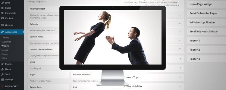
WordPress sidebars appear on every page of the site by default which is where my photo is but you could always place your image on the “About Us” section as well.
If you’re interested to learn more about conveying the right image see what makes a face trustworthy?

2. Tell Me About You
The website About page is a tremendous opportunity to cement a relationship between provider and customer.
When a customer views this page they’re expressing interest in the people/person behind the brand, so let them to discover your origins, story, mission, personality.
Using videos, podcasts and blogs on the About page are chances to tell the audience about the why and the who surrounding your business.
How It’s Made
Did you see the McDonalds video disclosure on how McChicken Nuggets are made?
I rarely eat McDonalds, but admittedly, I feel a bit better about what I’ve always regarded as a manipulative corporation playing mind games with children after witnessing what goes on in one of the factories.
Chipotle scored a viral hit with an aspirational video communicating their position on welfare issues affecting the fast food industry.
While they are not a small business and although you probably cannot afford a technical animated marvel, the emotionally resonating concept is magic:
To build out your “About” page, think about the answers to these questions:
- Why do you do what you do?
- Who are the people behind the business?
- What kind of people will customers be working with or buying from?
- What does your company stand for?
- What does your company stand against?
3. Reveal Your Geographic Location
When it comes to proving that your business is not some kind of scam or fake fly-by-night operation, establishing where your business is located is the low hanging fruit of trust building.
If you haven’t included an address on your website, don’t be surprised if people hesitate to contact you. Sometimes there are good reasons for not adding your address (if you work from home).
How do you think it looks when a business fails to list an address? What is there to hide? If you ARE a homeworker, use a virtual office address with a mail forwarding system.
4. Use Human Sounding Quality Blog Content
You want website visitors to stick around, right?
You want readers to devour your stuff, keep coming back, link to you, feel convinced and be converted into a happy customer?
This is why it’s important to aim to publish excellent quality human sounding blog content rather than quantities of generic encyclopaedia fluff.
Website content should fulfil some or all of the following criteria:
- Useful
- Compelling
- Educational
- Entertaining
- Problem solving
- Informative
- Transparent
Richard Branson is an expert in communicating his values through blogs.
By sharing his beliefs about family, honesty and the betterment of mankind, he has won legions of admirers worldwide.
He is no longer a small business – he’s a tycoon – but once again, just like with Chipotle, he has thought through his own principles and worked towards stating his position.
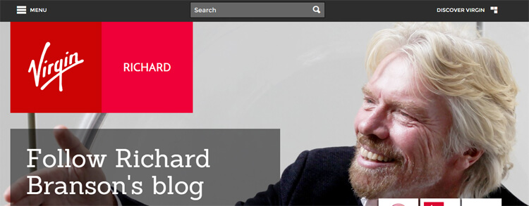
What I’d really like to draw attention to is Richard’s blog articles and the use of the personal pronoun “I”.
The casual first person narrative is very effective for someone like Branson, known more for woolly jumpers than stifling suits.
Think about your own audience and how they want to be spoken to. You don’t need to copy other people, but do step out from behind whatever limitations you’ve placed on your communication style.
Without question your content should be human. Adopt shorter words. Avoid sounding like an academic essay. Write like you talk.
My old graphic design student essays from 2004 are filled with fancy pants terminology because I was trying to sound authoritative in making arguments. This is what we were all taught to do in academic writing, at university, law school… whatever it was.
When a reader feels undecided about a website they’re looking at, a basic serving of meat and potatoes prose is ten times better than a bland word salad.
Instead of writing for their website, some businesses have had success producing audio podcasts. An actual spoken human voice is as human-sounding as you can get!
5. Win the Grammar & Spelling Test
Attention spans are in decline. Consequently, a website has mere seconds to make an impact.
 If you foolishly exhibit a kack-handed grasp of written language, don’t expect the casual visitor peering into your virtual shop window to bother walking through the door.
No one is perfect and we all make mistakes. I find spelling errors all the time, but the point is that I make the effort not to screw this up, even though I often do! 😀
But if you’re not even trying to maintain decent written editorial standards you’re doing a huge disservice to your image.
Case in point: know the difference between “effect” and “affect”. Correctly use “your” and “you’re”.
To avoid glaring literacy blunders it’s highly recommended to read real books with higher editorial standards – fiction as well as non-fiction – as an antidote to some of the crap online.
If you want to brush up on literacy take a look at The Compact Guide to Grammar for Busy People.
6. Have a Short Memorable URL
Avoid long, difficult to pronounce website addresses.
If you’re stuffing keywords like it’s 2010 you’re risking the would-be visitor dying of old age before they finish entering the URL in their browser.
You’ve seen businesses using very long subdomains, usually a free URL they got from a platform like Blogger or Wix.
Example: accountantforhireinbristol.blogspot.co.uk
Immediately, this ugly URL destroys any notion that this is a legit accounting service because it looks cheap, tacky, dodgy.
Instead, stick to something short and sweet. Something easy to pronounce using a paid for top level domain (TLD). Domains can be had from DreamHost or GoDaddy at a reasonable annual cost.
7. Demonstrate Social Proof
A significant proportion of webmasters don’t consider a valuable thing called “social proof.”
This is the practice of demonstrating social interaction around your brand to bring a sense of community to your website.
Follower numbers are often regarded – perhaps rightly so – as a vanity metric, yet a high social follower count plays into our hard-wired biological predisposition to think in terms of safety in numbers.

FYI: I removed these from my site as all the javascript was slowing load speed
Are the numbers are very low? As in less than 10 followers? It might be better to wait until you have a few hundred or few thousand before advertising those follower counts.
Don’t forget blog comments either. Encourage readers to leave comments at the end of blogs/pages so you can reply to them. And get Google reviews!
Other website visitors will witness these interactions and are more likely to form a higher opinion of your brand.
8. Use Professional Design
We take advice, news, products and services more seriously from one source over another because of a conscious or unconscious bias.
This is where graphic design and web design play their roles.
Good visuals help make your point and prop up written copy. It is like adding content to content.
Make sure any graphic design logos you commission is produced as vector paths using something like Adobe Illustrator. The quality is higher and the designs can be repurposed for other projects.
![]()
9. Disclose Data Usage
A privacy policy is where you tell visitors exactly what you do or do not do with any data they submit.
For example, if you have an WordPress email contact form, or a survey asking for their details, how are you handling that data?
Revealing what goes on behind the scenes is not only a massive affirmation of credibility, it’s common procedure and in most cases a legal requirement.
A single page covering all your legal stuff is fine, or you can break it into individual pages. Personally, I like to produce individual pages and then link to these pages from every other page of your website footer:
Take a look at my privacy policy, commenting policy and website disclaimer and you’ll notice the language used is pretty down-to-earth.
Oddly, it’s a subject some of my website design/development clients don’t expect me to bring up when discussing strategy. I guess it doesn’t seem like a priority but the devil is in the detail and it should really go without saying.
If you struggle with this, lots of free templates for website disclosure pages can be downloaded online and modified as appropriate.
10. Encourage Customer Reviews/Testimonials
Use your website to link to or display positive reviews and or/testimonials by delighted clients. Set up a page for your reviews/testimonials on your website and funnel undecided/new customers to this part of your site.
It’s possible you’ve already great reviews on Google Plus, Yelp, Facebook, Trip Advisor, LinkedIn or whatever it happens to be.
My advice is to copy those reviews to your website either by pasting the plain text or by taking screenshots. WordPress plugins exist to help organise this.
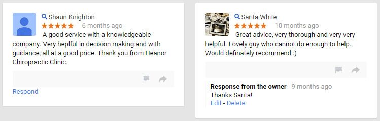
The reason I advise taking the screenshots is because Google reviews have a nasty habit of disappearing due either to bugs in their system or an overly aggressive spam filter.
Get listed on Google Maps and start collecting those votes.
Analysis: If People Don’t Feel They Can Trust You, They Will Never Buy Anything
Whether you’re a consultant, tiny team, or agency, those involved in the business operations can help make the brand warm and fuzzy and attractive.
The transactional business relationship occurs once a website visitor is satisfied by the expectations set.
Remember, people do business with people, so when in doubt, be human. Avoid the tendency some businesses have to try coming off as aloof, a big shot or a tough guy.
Everyone is scrambling to build a marketing mouse trap but many forget about creating a website that wears integrity on its sleeve.
Add Your Thoughts