Graphic design is a visual shorthand created and manipulated to communicate an idea or message.
The human brain processes imagery thousands of times faster than written words. Design might be seen as a performance or dramatisation of content.
Visual information in the correct context is a powerful rhetorical device. It compels the audience to make decisions. You can broadly split the discipline into two things: manipulation and inspiration.
What else counts as design? It is an organising principle, a naming convention and a mood setter.
Ideas and Information
The purpose of graphic design is to fulfill a useful, functional purpose. It is usually commercial in nature though not always.
A design brief is created based on a marketing plan with the intention of engaging the audience and soliciting a response.
Often, a copywriter will work with a designer to support the visual imagery with well chosen words.
“Graphic Design is not good design if it is irrelevant”
– Paul Rand
All types of communication involve sending a message with meaning. The exchange of meaningful information is vital to design.
I recently listened to a design podcast in which the host asked, “Is the designer a creator or an interpreter?”
The discussion was an interesting one. The podcast guest mentioned he had heard design described as “adding content to content.”
Do You Like Cake?
Because design is visual, it often makes sense to use analogies to explain how it works.
Let’s imagine design as a cake, of which there are three layers:
- Visual language (elements)
- Graphic design (Means, process)
- Visual communication (Results)
The visual language is the ingredients of the cake. If this visual language was verbalised, we would have sounds, words, pauses and intonation.
The graphic design is the finished, fully baked cake. When graphic design is verbailised we have spoken content and messages.
The visual communication is the eating of the cake. In verbal terms, this is the equivalent of a conversation or dialouge between people.
How Does Graphic Design Work?
As a designer, you should engage your audience through two visual and mental channels:
- Form
- Content
Let’s talk about these separately.
Form
The way something looks, or the physical appearance, is form.
- Imagery that is visually stimulating provokes a physiological response.
Form = Beautiful.
Content
What something says, or what ideas a thing communicates, is content.
- Imagery with meaningful, literal messages provokes a psychological response based on symbolic associations.
- There are opportunities here to be playful, subversive and intelligent.
Content = Useful.
Is it ACTUALLY Useful?
When we see a design for the first time, it initially registers as shape, colour, picture and type.
If the design is to work its magic on the audience it must become an idea.
The incredible power of design depends on some inherent meaning.
“I have two goals.
The first is that everything I do as a designer must have an idea; it cannot just look nice.
The second is, it has to look nice.
Without visual beauty, even a good idea will not pass.
Graphic design requires both ingredients, but the first priority is the idea…”
– Paul Rand, US graphic designer
The Language of Visual Communication
Visual language is made up of the following:
- Form – shapes and their relationships
- Colour – the effects of light on a surface
- Image – pictorial representations, pictures
- Type – letter forms with their own communication value
Visual Language Synonyms
Form, colour, type and image can be described in a number of ways. Listed below are some similar terms to describe the four components of visual language.
Form
- Visual matter
- Shape
- Composition, structure, layout
- Relationship
- Balance (symmetry)
- Space
- Figure/ground
- 2D > 3D > 4D
Colour
- Effects of light
- Surface
- Texture
- Value (tint and shade)
- Hue (colour)
- Saturation (amount of colour)
- Radiance, reflection
Type
- Communication mark
- Speech symbols, letters
- Value symbols, numerals
- Idea symbols, icons
- Alphabet
- Letter > word > text
- Typography
Image
- Representation
- Picture
- Figurative (pictorial)
- Non-figurative (abstract)
- Symbol, motif
- Diagram, graph, map, chart
- Photograph
- Drawing
- Reproduction, print
Content Types of Visual Communication
Informative
One purpose design fulfills is to provide information to the audience.
Imparting knowledge, giving facts and increasing one’s understanding falls into the remit of any of the following:
- Signs
- Directories
- Plans
- Manuals
- Guides
- Instructions
- Museums
- Exhibitions
Persuasive
The commercial applications of design are intended to influence consumer behaviour and decision making.
Design with commercial intent can and often does mix in elements from the “informative” list above.
The list below is commonly associated with persuasion in design:
- Newspapers
- Magazines
- Annual Reports
- White Papers
- Brochures
- Posters
- Commercials
- Store Displays
- Packaging
Entertaining
Entertainment within graphic design is meant to stimulate an emotional response. To excite, engage or titillate the audience can be very powerful when done right.
Designers can use their visual communication skills to hold the attention of a person with amusing or diverting visual information/language.
If you can get a laugh from a piece of design, you’re onto something. 😀
Emotions have a crucial role for human beings having the ability to understand the world.
Form and content has the power to be not only informative and persuasive, but visceral.
Concepts of Visual Communication
The fundamental principles of design will never change.
- Visual language is universally perceived – think how you make offensive hand gestures during road rage!
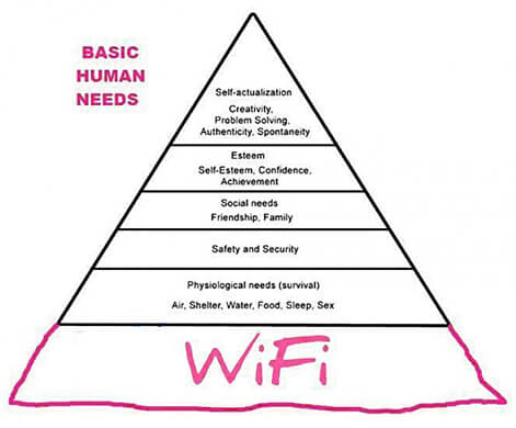
- Design serves the basic needs of the human race – food, shelter, love, ego, status, safety, fears etc.
- Design always references the natural world, mathematical laws and psychics – visual properties, structures and systems.
Context (time and place) will always affect the final visual communication. The results are interpreted via culture, technology, zeitgeist and political/social/economic setting.
“Visual communication is based on four principal realities:
The reality of man, as measure and measurer.
The reality of light, colour, texture.
The reality of space, motion, time.
The reality of science.”
– Will Burtin, US graphic designer
Less is More
Subtracting extraneous or irrelevant visual information lends more potency to what remains.
It is true to say that too much of anything waters down the message. Polarize your design by distilling it to the basic elements.
Putting too many ideas in one design is confusing. A good phrase to keep in mind at all times is “Keep it Simple, Stupid!” (KISS)
Small Biz Geek Logo Concepts
Following on from the less is more argument, I played around with some design ideas for the logo of this website.
It’s not a brilliant logo and I might change it.
The logo started off being rather complex and a little too busy. There were elements I liked a lot in the design but in the end I had to get rid out the silhouetted “geek” and computer. There was too much going on visually.
If a design element is not suited to a particular project,save it in your library. It might be usable on something else.
An understanding of semiotics allows designers to explore the relationship between form and content. Studying the meaning of symbols, motifs, analogy, metaphor is useful for a kind of word-play in pictures.
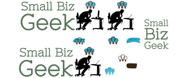
The agony of choice
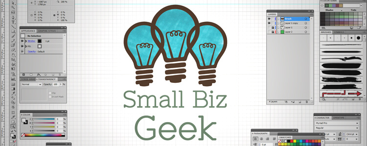
In the end, I went with the three linked light bulbs idea.
It was created using Adobe Photoshop and Adobe Illustrator so the artwork is a high res vector drawing. The turquoise gradient is felt tip pen scanned into the computer as raster image. That raster part will not scale well so I’ll be changing it.
The video below shows my thoughts surrounding the logo:
Graphics Gone Wrong: A Rude Awakening
Below is a video myself and a work associate, Lee, produced for the benefit of our local web design clients.
We recorded this presentation this discussion to highlight the very real problems of bad design. We are not rude or dirty minded people. We have trained ourselves to spot design sending the wrong message and eliminate it from our own work.
The clip below is from a longer video given to graphic design clients as a crash course on design concepts:
Graphic Logo Concepts
Are you a small business wanting to learn more about design?
Myself and Lee Francis produced this graphic logo concepts video to educate clients. It’s quite long at 40 minutes but saves us trying to explain the principles of design over the phone.
Posts About Graphic Design
Badly Behaved Images? Leverage the Power of Vector Graphics to Eliminate Unruly Design
Say What? How Your Website Colours Communicate
Business Card Idea: Hand Stitched Price Tag
Is Offline Marketing Still Relevant in a Digital World?
How to Paint Canvases Using PhotoShop Templates
Fast Food Restaurant Owner? Market Your Menu with QR Codes



Add Your Thoughts