Illustrator is an industry standard vector graphics program used by designers creating high quality digital drawings for both print and digital channels.
The beauty of these vector objects is that the shapes are based on mathematical calculations. Vector objects never lose quality when you scale them because you are not stretching pixels.
This solves the issue of bad, low-quality stretched-out raster images. The scalable vector graphics (SVG) design approach from the get go solves multiple problems and leads to a design that can be repurposed and resized for everything. If you purchase graphic artwork, make sure you’re being supplied with the SVG masters.
There are no resolution settings until you come to export the file.
I like using Illustrator for my graphic design needs but sometimes find it fiddly and unintuitive. A digital graphics tablet has been added to my wish list. There could be some opportunities for using nice brushes with the freehand effects of the tablet.
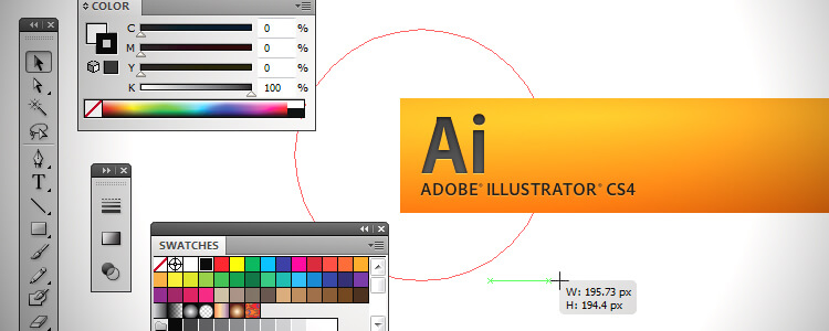
The main toolbar has dozens of options to choose from but you’ll probably need to use less than half of the available options.
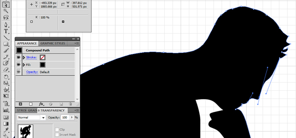
Drawing vector paths requires the use of the Pen Tool – the most commonly used feature.
Pen Tool
There’s a steep initial learning curve but the rewards are worthwhile. You can get similar results with Photoshop if you use the paths functionality but if you’re going to do that you’d be better off using Illustrator because that is what it’s designed for.
You can draw closed paths or open paths, and fills/gradients can be added to these objects. Some people use a cheap graphics tablet with the Illustrator pen tool because they can take a hand drawn approach instead of negotiating with awkward mouse movements.
Type Tool
The type setting tool is good, but if you’re working mainly on typographical layouts, such as brochures, try InDesign, since it is more geared towards type.
Fills, Strokes, Gradients
There are some creative ways to use these, especially when you intersect or combine different paths. I like to use different shapes to knock out negative space and then add strokes to the paths that have been created.
And The Rest…
Illustrator is a HUGE program. I feel I’ve hardly scratched the surface. Overall, I’ve probably used less than 10% of the program’s features to design logos and have still gotten good results; it’s another iceberg, like most Adobe Creative Suite software!
A good design is not about how many effects or fancy schmancy bells ‘n’ whistles you use. It is about communicating visually with your audience. Always view design tools as a means to an end.
Organising Tips: Label Your Layers
Layers work a bit different to the way they do in Photoshop.
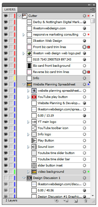
Layers can get messy during artwork design, so consider organising and grouping them at the end.
It’s a good idea to use descriptive labels with a logical naming convention. This all sounds like a hassle but in truth it makes your project much easier in the long run.
Aim to have a working file that is coherent, especially if you’re going to be working with other designers using the same files.
Sometimes, you get sent a file where the layers are more than a little messy, and it’s up to you to pick through the untitled layers and make sense of it. This can be confusing.
A good tip for identifying untitled layers is to use the magic wand tool.
Using the magic wand, you can select various parts of your design and, assuming you have the layers window open, it will highlight the corresponding layer in the layer window using small coloured squares.
Adobe themselves have a good Illustrator CC tutorial about organising artwork with layers. The principle applies to older versions of the software too.
A Common Print Design Problem
Anyone without a working knowledge of design often expect a designer to be able to “blow up” a bitmap/raster image to a size and quality suitable for print.
You just cannot enlarge a .JPEG and expect it to maintain its quality. The pixels get stretched and ruined. Your image will be blurry and the results are amateur.
Amazingly, some businesses still cannot see this even when it is explained to them in detail. They settle for disgraceful, low-quality crap which wastes their money and damages their their brand image – literally.
If you’re serious about your logo, business card and others marketing materials, commission the project to be created by an experienced designer using vector software.
Hell, it doesn’t even have to be Illustrator. Corel Draw is an alternative capable of producing professional graphic design.
Scaling Vector for Print Design
Vector paths are painstakingly drawn by the designer and can be adjusted or enlarged. The lines and shapes that make up a vector design are elastic.
- Do you want to add graphics to your company vehicle? No problem.
- Do you want to print a logo to clothing and apparel? No problem.
- Thinking of using a different printer for the next run of leaflets? If you have your design in vector format, it can be done.
Designing for Web
Web design images are rendered at 72 pixels per inch, whereas print design (with the exception of classified newspaper ads) is usually at a minimum of 300 pixels per inch.
Approach your website design from a print design mentality. Make a crisp, high quality image suitable for anything and everything and size it for the screen from there.

Create your logo high res then scale it down for your website
Illustrator Native File Format
Most designers will supply graphic artwork in the native .AI file used by Adobe Illustrator.
You can hand that file over to a different designer/artworker and have them work on it.
Using a proprietary suite of tools like those created by Adobe does offer a better workflow experience.
The files can be easily copied to USB sticks along with supporting documentation or material. I will often send an mp3 recording of myself talking to the client so they have something to listen to while they look at the artwork they’ve received.
Adobe Illustrator Client Logo Discussion
The following video is something myself and one of my design colleagues produced for a client.
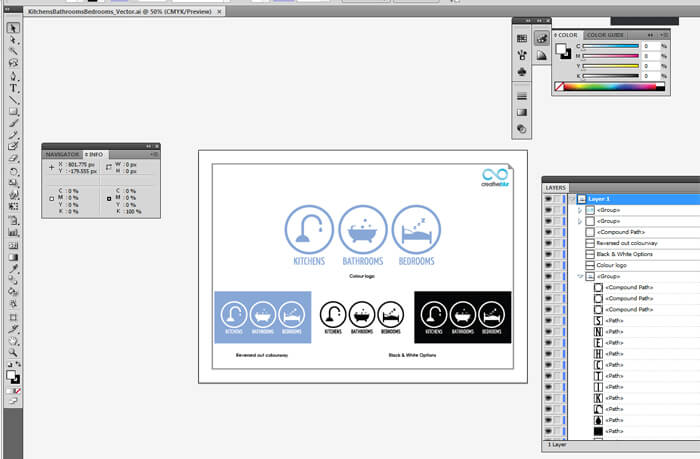
We recorded the sound and then added screenshots from within Illustrator to show how the logo had been constructed.




Add Your Thoughts