Whether you’re a business owner, manager or tech person, Don’t Make Me Think by Steve Krug is essential for those making decisions about website design and development.
Is your website easy to use, logical and intuitive? Written in 2000, updated in 2006 and revised again in 2013, this book will open your eyes to problems you never knew existed. This well illustrated guide is one that can be referenced frequently in the pursuit of producing smoother websites with less sticking points.
While some site visitors will grimace and put up with a bad experience, the rest will leave.
Yes: the browser Back button is clicked more than any other! 🔙🙈
Despite the last iteration of the book being in November 2013, the principles hold up pretty well; in terms of how people navigate sites, we’re dealing with the unchanging habits, quirks and prejudices of human nature. 🫥
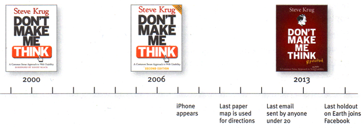
Steve Krug’s humorous take on the revisions of his book
Continuous Improvement of the Digital User Experience
A chapter about the constraints and trade-offs of mobile design have been added, although, since 2013, we’ve seen a Google-led renaissance for the small screen with the likes of:
📱 Google Accelerated Mobile Pages
🔒 http security warnings in Chrome
When we pre-empt website user behaviour based on what we already know to be true about people, many potential problems might never arise and then there doesn’t need to be lots of backtracking or catching up. There is an entire industry dedicated to User Experience Design, or, to coin the abbreviation, UX.
Let’s step back for a minute and give some consideration to the usability of everyday things outside the realm of screens and pixels. 🤓
Make Your Design Intuitive, Obvious and Easily Usable
When was the last time you had to learn to operate a light switch? 💡
Or a pair of shoes? A fork, a door knob, a t-shirt? A set of traffic lights or a book?
Never. You’ve never had to learn to operate such things because your understanding is obvious and intuitive and automatic. That’s thanks to good design. 👏
Now think about the worst customer service phoneline you’ve ever used. I will bet it involved an illogical audio selection or dial pad menu. 😖
A Common Sense Approach to Web and Mobile Usability
“The first law of usability is “Don’t Make Me Think.” Eliminate question marks in the minds of the users.”
– Steve Krug
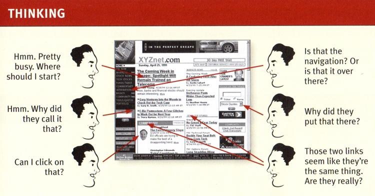
When you’re creating a site, your job is to get rid of the question marks.
Layout: Navigating Virtual and Physical Spaces
Consider the physical spaces you regularly navigate and take for granted. When it goes smoothly, and you find what you want, it doesn’t register in your mind, but when you cannot find the thing you need, you notice the problem you are facing. 🤔
In the first few pages, usability is defined as follows:
“A person of average (or even below average) ability and experience needs to be able to figure out how to use a thing to accomplish something without it being more trouble than it’s worth.”
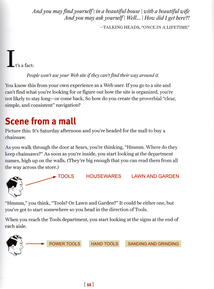
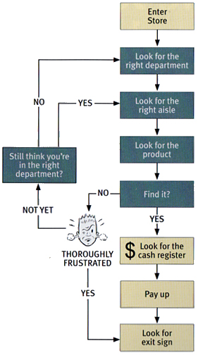
The author compares the layout of websites to the layout of stores to great effect. One is virtual, the other physical, yet we navigate the space in the same way: we all have a set of unconscious objectives either helped or hindered by the design and layout.
Personally, as someone who doesn’t always wear his glasses, I can get confused, lost and irritated. 👀
What Does (and Should) a Typical Customer Journey Look Like?
The flowchart diagrams below demonstrate a typical consumer journey in a physical store. Now, imagine this concept applied to your website. Substitute physical signs, notices, aisles, shelves and ticketing with their virtual equivalents. ️💻🖥️📱
Imagine how the positioning of elements, use of headings, choice of colours and wording of hyperlinks can either frustrate or delight a visitor.
Here’s how you interact with the the design and layout of a store (whether you realise it or not):
“Basically you use the store’s navigation systems (the signs and the organizing hierarchy that the signs embody) and your ability to scan shelves full of products to find what you’re looking for.
“It’s a decision based on a number of variables – how familiar you are with the store, how much you trust their ability to organize things sensibily, how much of a hurry you’re in, and even how sociable you are.”
Theory of Web Design
A good chapter is chapter 7 – “The Big Bang Theory of Web Design”, which is about the importance of getting people off on the right foot. 🤝
Site identity and mission has to be communicated quickly and clearly, typically by way of the logo area positioned on the top left and a description underneath or to the side of that, aka tagline.
“Good taglines are personable, lively, and sometimes clever. Clever is good but only if the cleverness helps convey – not obscure – the benefit.”
There are dozens of rules for web design that only tend to stand out when they’re disobeyed, or absent. When the rules are adhered to, the user experience becomes seamless: there is no disruption to the flow and the user feels like they’re surfing your website. 🏄
A site should aspire to be:
- Useful
- Learnable
- Memorable
- Effective
- Efficient
- Desirable
- Delightful
Common Reasons for Bad Website Design
Frequently, too many stakeholders personally intervene with requests, additions, agendas and constraints. This is amusingly documented in the cartoons:
The phrase, “a camel is a horse designed by committee” should be written on the inside page of the book before being passed around and fully absorbed by all colleagues and associates working on a project.
Curb Your Creativity and Prioritise Clarity for Users
Some developers and designers are unable to temper their own creativity. Instead of keeping things logical, simple and helpful they become enraptured with fanciful notions that are nothing more than gimmicks. 🙄
If you’re a more enlightened developer, you may be tasked with steering clients away from any requested design features known to be self-defeating.
Autoplay videos, splash screens, complex navigation, too many typefaces and slow load times are some of the things that irritate users and tax their brains. 😩
Many core design elements should be respected as part of the orthodoxy of design, and yet they’re so frequently overlooked.
➡️ Case in point: remember when Microsoft got rid of the Windows 8 Start button on the bottom left? There was outcry because this reliable, well-known staple feature had been removed without consideration for the people that actually wanted it. 😕
How to Conduct User Testing
Later chapters talk about user testing. User testing is a handy but often ignored process that serves to reveal the truth about how people interact with the website and what they think when they run into problems. 💬💭
- If you want a great site, you’ve got to test
- Testing one user is 100 percent better than testing none
- Testing one user early in the project is better than testing 50 near the end
Other practical tips from the book on how to conduct testing include recording device screens of those navigating the website. 🖱️🖥️🗣️
In my experience, using software such as Screencast-O-Matic (a tiny annual price for the premium version) for desktop PCs is a good method because a mic can be set up so that both video/audio is captured for later playback and analysis. ⏺️▶️
Similar screen recording software is available for desktop Macs, but the point is to actually get people using the site and record their behaviour for analysis. I often review the websites of new clients and can sometimes find problems they didn’t know existed. 🔍👨💼🔧
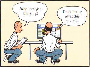
A website user testing session in action
Demo Usability Test
For mobile, both Android and Apple include video/audio screen recording in their operating systems. This means no awkward jerry-rigged camera set up is required.
It’s also vital to explain to all users taking part in the tests that you’re testing the website, not them. 👥🖥️
However, we must remember that there IS such a thing as user error – like entering passwords incorrectly, misspelling something or allowing a website confirmation email to land in “Junk” without checking.
Download the script used in the video to conduct the test (PDF)
Smartphone Screen Recording for User Testing is Easier Now
In 2017, I tweeted Steve Krug about the then recently-introduced screen recorder to the recent version of iOS – the mobile app that can capture audio/visual activity on handheld devices.
Twitter: Easier UX Testing: iOS 11 Introduces Screen Recorder
His DIY camera rig blueprint for user testing on phones (page 162) is now redundant. It’s just not necessary when most phone screens can be recorded.
Summary: A Brilliant Guide to Creating a Well-Oiled Machine
This is a thin book, easy to read, humorous and colour illustrated in a way that few are. One Amazon review remarks, “Most usable book about web usability, funny and easy to read.” 🙏
I innocently started reading this book at work before, then struggled to put it down to get any ‘actual’ work done! Fantastic read – and like @skrug says “it’s not rocket surgery” – thanks for the recommendation @debrawilsonsays ??? #webusability #dontmakemethink pic.twitter.com/7CFGikGXxo
— Rebecca Cassidy (@rebecca_cassidy) November 8, 2017
Whether you’re the person who actually pushes pixels or the one who hires someone else to do that for you, you want both the business and the customer to be successful in their objectives through the website. 🤝👍
Remember to adopt the philosophy of good usability, which I’ll repeat once more for emphasis:
A person of average (or even below average) ability and experience needs to be able to figure out how to use a thing to accomplish something without it being more trouble than it’s worth.
Make your website well-oiled business machine, not a wouldn’t-it-be-nice vanity project. Kill your darlings. Say “no” to obviously bad ideas and question your own held assumptions before spending time and money building something that might only ever confuse and confound those expecting to interact with it.
Buy the Book Now
You can buy the book online on Amazon (affiliate link) or at most good book shops.
More Stuff on Website Design and Layout
♿ Computer Says No: Does Your Website Work for People with Disabilities?
💻 Cheap Instant Website Builders: Should We Dump Them?
🧮 20 Years On and Website Hit Counters are Still a Waste of Pixels
🚥 Say What? How Your Website Colours Communicate
🤖 Overwhelmed by Web Design? Use This 10 Step Project Checklist and Stay in Control
😇 10 Website Trust Signals You Can’t Afford to Ignore
📱 In the Pandemic, QR Codes are Finally Proving Worthy in the West
🛑 Browser Ad Blockers are Destroying Website Functionality and Killing Content
🤨 This WordPress Media Uploader Problem Makes Your Blog Look Amateur



Add Your Thoughts