Rather than talk about how big, old or great your business is, create a website that demonstrates your ability to solve your prospects’ most pressing problems.
The average website belonging to the average business has a very average message. Meaning, most businesses use their website as an opportunity to brag, chest beat and generally shout from the rooftops about how great they are.
While there is a time and place for that sort of thing, the people who are most interested in giving you their money in exchange for solving their problems (prospects!) need to know you understand them, know their pain, and what they’re trying to achieve. Simple!
Therefore, a good landing page should function as a sales letter. If you were to strip away the images/visuals, you’d be left with meat and potatoes sales copywriting that packs a punch.
Sadly, most salespeople seem determined to vomit their life story all over the poor prospect who only really wants to be convinced that you can help them get their ideal outcome.
Landing Pages: The Website Wireframe Formula for Service-based Businesses
The wireframe down below is a rough sketch showing where page elements should generally be placed.
- It’s not drawn to scale, so don’t rely on it for exact spacing or dimensions.
- Read the notes carefully so you understand the intent behind each section and how to use it effectively.
Top Section
- Headline
- Acts as a short, attention-grabbing statement that appeals to the visitor’s needs.
- Logo
- The business logo should be placed clearly in the top navigation area.
- Phone Number & Tagline
- Use a real business number and create a concise, meaningful tagline.
Navigation Area
- Includes the logo, headline, benefits/description, and a call-to-action button.
- The CTA should immediately encourage visitors to take the next step or request more information.
Main Message Block
- Headline
- A strong phrase that introduces the core value you offer.
- Benefits / Description
- Brief details that support the headline and clarify what you provide.
- Call-to-Action Button
- Prompts the visitor to act quickly (e.g., learn more, request a quote).
Reviews Section
- Use customer reviews to build trust and strengthen your credibility.
- Testimonials should be easy to read and ideally come from real customers.
Supporting Content Block
- Sub-headline
- Reinforces the main headline and transitions into additional selling points.
- Compelling Sales Copy
- Persuasive content that highlights why your product or service stands out.
- Supporting Photo
- An image that visually supports the company’s credibility.
- Add a caption beneath the image to explain its relevance.
Footer Section
- The footer should contain:
- Contact information
- Additional navigation
- Social media links
- Copyright notice
- It can also include other important business information such as certifications or memberships.
Visual Wireframe Example
Here’s the wireframe demonstrating the formula for a website landing page (and this probably should be your homepage).
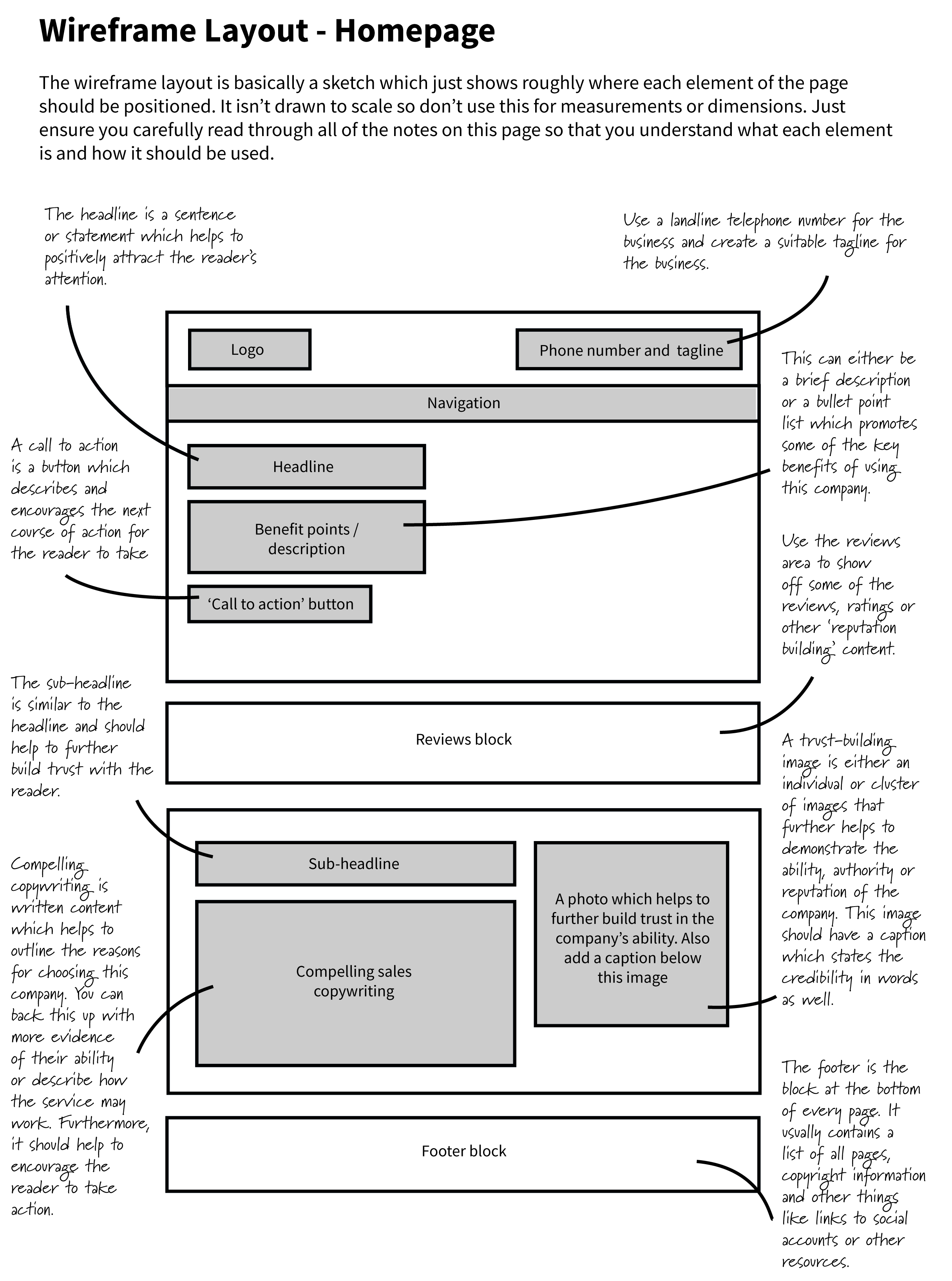
Website wireframe layout for a sales homepage (select to view larger)
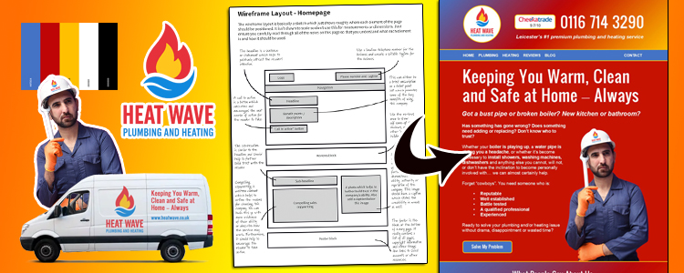
Below is a mocked up, filled-in version of that wireframe using images I sourced online for free. I used AI to knock together the logo which was repurposed for other sections.

The fully mocked up wireframe (select to view larger)
You may notice that the words used in the sentences and paragraphs are emotive. This is key. People make decisions based on their emotions, not logic. Anyone who claims to be 100% logical is lying to themselves. Sales requires reaching people on an emotional level, and that requires lots of empathy.
Thank you for the useful information.
Great breakdown of how a service-focused landing page should be structured — especially the part about treating it like a sales letter and focusing on visitor needs, not business bragging.